7 Grid Graphics, Including ggplot2
“If you think you can learn all of R, you are wrong. For the foreseeable future you will not even be able to keep up with the new additions."
- Patrick Burns, CambR User Group Meeting, Cambridge (May 2012)
7.1 Grid Graphics
There are a large number of auxiliary R packages specifically for graphics. Many of these utilize or extend the base R graphics approaches described in Chapter 6. Several successful newer packages, however, rely on the R grid graphics system (see Murrell (2019)), codified in the package grid (R Core Team 2023). The grid graphics system itself provides only low-level facilities with no high-level functions to generate complete plots. Nonetheless, several successful packages have built high-level functions on grid foundations including:
- lattice: one of the first serious attempts to build high-level functions for grid graphs (Section 7.2).
-
gridGraphics: converts plots drawn with the base R graphics, e.g.,
plot(), to identical grid output. - ggplot2: a deservedly popular grid package that “\(\ldots\) tries to take the good parts of base and lattice graphics and none of the bad” (Wickham 2016).
Functions from ggplot2 are the major focus of this chapter.
7.2 lattice
Among other applications, the lattice package (Sarkar 2008) contains functions for implementing the trellis graphical system (Cleveland 1993)106, so-called because it often utilizes a rectangular array of plots resembling a garden trellis (Ryan and Nudd 1993). Trellis plots, generated from lattice, are an important component of several important R packages, including nlme, which allows the generation of linear and nonlinear mixed effects models (see Aho (2014), Ch 10).
Example 7.1 \(\text{}\)
A simple example of trellis plotting is shown in Fig 7.1. The datasets::Indometh dataframe, previously used in Examples in Ch 6, records pharmacokinetics of the drug indomethacin, following intravenous injections given to human subjects. The dataframe belongs to several grouped object classes, defined in nlme, which have their own plotting methods (see Section 8.7), and are implemented through a generic call to plot(). We are, of course, more familiar with the use of the generic call plot() in base R graphics approaches, implemented via the graphics package.
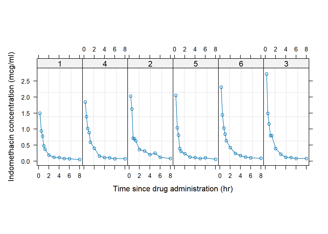
FIGURE 7.1: Example of a trellis plot. Indomethacin levels are tracked in six human subjects over eight hours following intravenous injections.
\(\blacksquare\)
The lattice package contains several high level plotting functions that can be considered analogues of base R graphics functions. These include:
-
lattice::xyplot(), which is similar tographics::plot()in its defaulttype = "p"mode, -
lattice::histogram(), which is analogous tographics::hist(), -
lattice::barchart(), which is similar tographics::barplot(), -
lattice::levelplot(), which is analogous tographics::image(), and -
lattice::wireframe(), which is similar tographics::persp().
In general, trellis plots in lattice can be created using a conditional formula as the first argument of its functions. This will have the form y ~ x|z, which signifies y is a function of x, given levels in z.
Example 7.2 \(\text{}\)
Consider a summarization of the association of age and tobacco use (LOW and HIGH) and esophageal cancer cases using the e.cancer dataset (Breslow and Day 1980) from asbio (Fig 7.2).
data(e.cancer)

library(tidyverse)
means <- e.cancer |>  # obtain means
  group_by(age.grp, tobacco) |>
  summarize(cases = mean(cases))

library(lattice)
barchart(cases ~ age.grp|tobacco, data = means,
         xlab = "Age", ylab = "No. of cases")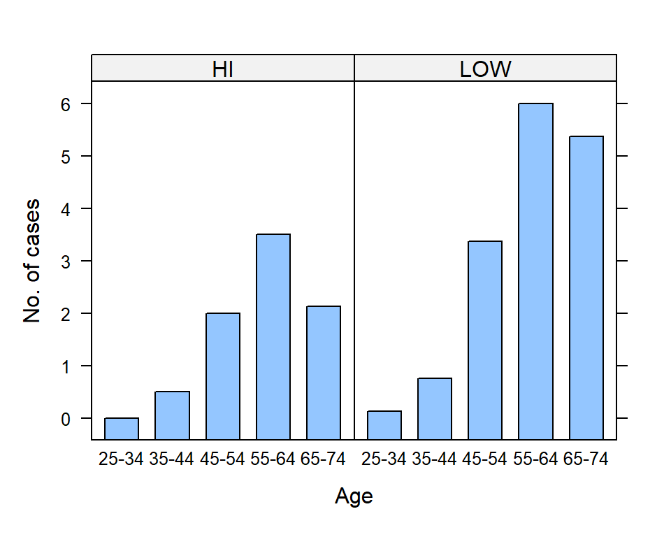
FIGURE 7.2: Use of lattice::barchart() to illustrate changes in esophogeal cancer cases with subject tobacco use and age. Bar heights are means.
Note the use of pipes and tidyverse functions (Ch 5) to obtain mean numbers of cases for combinations of levels in age.grp and tobacco (Lines 4-6). The formulacases ~ age.grp|tobacco (Line 9) indicates that the mean cases should considered as a function of levels in age.grp, given levels in tobacco.
\(\blacksquare\)
Approaches in lattice can be used in many non-trellis applications.
Example 7.3 \(\text{}\)
Figure 7.3 provides examples of three dimensional graphics generation using the lattice functions levelplot(), contourplot(), and wireframe(). The functions are easiest to use when data are in a spatial grid format with row and column numbers defining evenly spaced intervals from some reference point, and cell responses themselves constitute “heights” for the z (vertical) axis. The popular volcano dataset, used in the figure, describes the topography of Maungawhau / Mount Eden, a scoria cone in the Mount Eden suburb of Auckland, New Zealand. In this case, rows and columns represent 10m Cartesian intervals. The first row contains elevations (in meters above sea level) for northernmost points, whereas the first column contains elevations of westernmost points. The argument split in plot.trellis() is used with both graphs in Fig 7.3 (Lines 5 and 7). It is a vector of 4 integers c(x, y, nx, ny) that indicate where to position the current plot at the x, y position in a regular array of nx by ny plots.
library(lattice)
plot(levelplot(volcano, col.regions = heat.colors,
               xlab = "x", ylab = "y"),
     split = c(1, 1, 1, 2), more = TRUE,
     panel.width = list(x = 5.4, units = "inches"))

plot(wireframe(volcano, panel.aspect = 0.7, zoom = 1,
               lwd = 0.01, xlab = "x",
               ylab = "y", zlab = "z"),
     split = c(1, 2, 1, 2), more = FALSE,
     panel.width = list(x = 5.4, units = "inches"))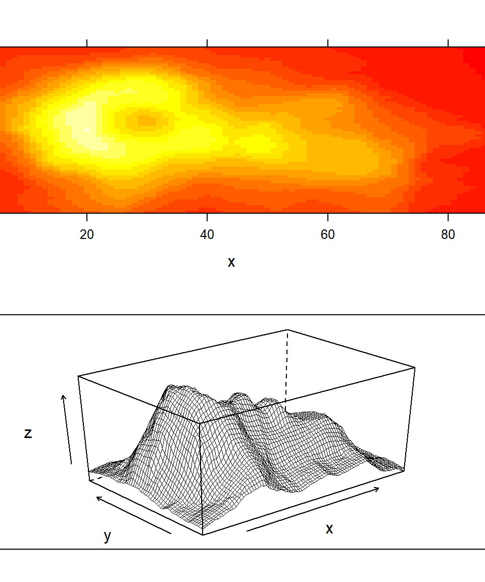
FIGURE 7.3: Representations of Maungawhau (Mt Eden) using lattice functions.
\(\blacksquare\)
While lattice can be used to generate nice graphs, many users have found its coding requirements to be burdensome and non-intuitive. This issue, coupled with the desirable characteristics of the grid graphics system, prompted the development of the package ggplot2, one of the tidyverse collection of packages (Ch 5).
7.3 ggplot2
The ggplot2 package (formerly ggplot) emulates the “grammar of graphics”, that underlies all statistical graphics (Wilkinson 2012). The success of the ggplot2 package is evident in its rich ecosystem of contributed extension packages. Detailed descriptions of the ggplot2 package can be found in Wickham (2010), and Wickham (2016)107. Helpful ggplot2 “cheatsheets” can be found here. Like most grid implementations, ggplot2 does not play well with base R graphics. In fact, ggplot2 is based on its own unique object oriented system, the ggproto system 108.
7.3.1 ggplot()
The function ggplot() is used to initialize essentially all plotting procedures in ggplot2. There are three common approaches:
-
ggplot(df, aes(x, y, other aesthetics))Heredfis a tibble or dataframe. andaes()represents aesthetic mappings. This approach is recommended if all graphical layers will use the same data and aesthetics. -
ggplot(df)Here only the dataframe or tibble to be used is identified up-front. This approach is useful if graphical layers use different \(x\) and \(y\) coordinates, drawn from the same dataset,df. -
ggplot()Here a ggplot skeleton is initialized that is fleshed out as layers are added. This approach is recommended if more than more than one dataset is to be used in the creation of graphical layers.
One of these formats will be used as the first line of code when creating a ggplot2 graphic. Layers will then be added representing geoms, themes, and aesthetics (see Section 7.3.2 immediately below). To clarify coding steps, this is typically done by separating layers into lines, connected with the ggplot2 operator, %+%, which can be called using + in the context of a ggplot.
Example 7.4 \(\text{}\)
In the code below I have initiated a ggplot, under Approach 1 discussed above, using data from a dataframe called df that contains variables named x and y, that will define the \(x\) and \(y\) coordinates for the items in the plot. I have also added two geom layers and a theme, via the imaginary functions geom1(), geom2() and theme1().
\(\blacksquare\)
7.3.2 Geoms, Aesthetics, and Themes
The ggplot2 package facilitates the generation of overlays with geoms, short for “geometric objects”, aesthetics, and themes. A number of ggplot2 geom functions are shown in Table 7.1. Note that arguments in geom functions are fairly consistent. The argument mapping refers to aesthetic mappings, often specified with the ggplot2 function aes(). A few aesthetic mapping functions are shown in Table 7.2. An explicit definition for the stat argument is required by several geoms, e.g., geom_col() and geom_bar(), and can take the form stat = "identity", indicating that raw unsummarized data are to be plotted. The ggplot2 package also allows specification of general graphical themes including user-defined themes, via the function theme(). An exhaustive list of \(> 90\) potential theme() arguments can be found by typing ?theme. Pre-defined ggplot2 theme frameworks include theme_gray(), the signature ggplot2 theme (with a grey background and white gridlines), theme_bw(), theme_classic(), theme_dark(), theme_minimal(), and many others.
| Geom function | Usage | Impt. arguments |
|---|---|---|
geom_abline() geom_hline() geom_vline()
|
Add reference lines |
mapping data slope intercept
|
geom_segment() geom_curve()
|
Add lines and curves |
mapping data position
|
geom_area() geom_ribbon()
|
Area and ribbon charts |
mapping data stat
|
geom_bar() geom_col()
|
Bar charts |
mapping data stat
|
geom_bin2d() |
Heatmap of bin counts |
mapping data stat
|
geom_boxplot() |
Boxplots |
mapping data stat
|
geom_contour_filled() |
2D contours of 3D surface |
mapping data stat
|
geom_count() geom_sum()
|
Count overlapping points |
mapping data stat
|
geom_crossbar() geom_errorbar() geom_linerange() geom_pointsrange()
|
Lines, crossbars, error bars |
mapping data stat
|
geom_density() |
Smoothed densities |
mapping data stat
|
geom_density_2d() geom_density_2d_filled()
|
Contours of 2D densities |
mapping data stat
|
geom_dotplot() |
Dot plots |
mapping data position
|
geom_errorbarh() |
Horizontal error bars |
mapping data stat
|
geom_freqpoly() geom_histogram()
|
Histograms |
mapping data stat
|
geom_function() |
Draw curve from function |
mapping data stat
|
geom_hex() |
Hexagonal heat map |
mapping data stat
|
geom_jitter() |
Jittered points |
mapping data stat
|
geom_text() |
Add text |
mapping data stat
|
geom_point() |
Add points |
mapping data stat
|
| Function | Usage | Arguments |
|---|---|---|
aes() |
Aesthetics of geoms |
x,y
|
colour(),fill(),alpha()
|
Color aesthetics | See ?aes_colour_fill_alpha
|
linetype(),size(),shape()
|
Line type, size, shape | See?aes_linetype_size_shape
|
group() |
Grouping | See ?aes_group_order
|
7.3.3 Boxplots
Figure 7.4 shows a boxplot of R.A. Fisher’s classic potato dataset from the Rothamsted Experimental Station (Fisher and Mackenzie 1923). There are three important coding features that should be recognized in the chunk below. First, the plot was initialized using the first approach described in the previous section: ggplot(df, aes(x, y, other aesthetics)) (Line 2). Specifically, the dataframe to be used, potato, was identified, and the coordinates for the plot were defined inside aes(). Second, plot modifications are added with the functions theme() (which includes a call to the function element_text() to change the angle of text on the x-axis), xlab(), and finally, geom_boxplot() (Lines 3-6). Third, the continuation prompt, +, is placed at the end of lines of code to indicate that another graphical layer is being added to the plot. In ggplot2, +, is somewhat analogous to the forward pipe operator, |>, used in the tiddyverse (Ch 5). Specifically, it denotes the continuation of ggplot2 plotting commands for a particular graphic. This continuation is broken with a line break (Line 6).
data(potato) # in asbio
ggplot(potato, aes(x = factor(Variety), y = Yield)) +
  theme(axis.text.x = element_text(angle = 50, hjust = 1,
                                   vjust = 0.9)) +
  xlab("Variety") +
  geom_boxplot()
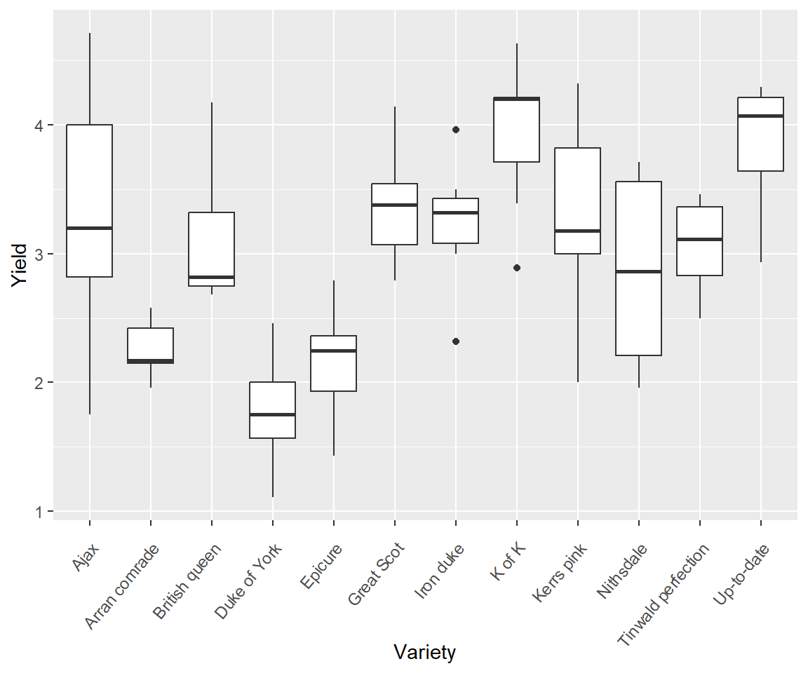
FIGURE 7.4: An example of a ggplot2 boxplot. The general theme of the plot is theme_gray(). This is the signature appearance of ggplot2 graphs: a grey background and white grid lines.
7.3.4 Saving Plots
Plots can be saved using the function ggsave() or with a graphical device function, e.g., pdf(), png(), as described in Section 6.3.2.1.
g <- ggplot(potato, aes(x = factor(Variety), y = Yield)) +
  theme(axis.text.x = element_text(angle = 50, hjust = 1,
                                   vjust = 0.9)) +
  xlab("Variety") +
  geom_boxplot()

pdf("potato.pdf")
print(g)
dev.off()
png
2 Importantly, unlike graphics::plot(), a graphics object can be created under grid approaches. This is demonstrated on Line 1, where the ggplot is assigned to the object name g. In Lines 7-9, the graph is rendered, using print.ggplot(g) or plot.ggplot(g), and compiled.
The object g has ggplot2-specific classes "gg" and "ggplot",
class(g)[1] "ggplot2::ggplot" "ggplot" "ggplot2::gg" "S7_object"
[5] "gg"
7.3.5 Line Plots
Line plots are generally rendered using the function geom_line().
In Fig 7.5 we consider the Fisher’s potato data under a line plot approach. This presentation allows us to consider both potato variety and fertilizer levels. Note that I distinguish categories in the variable Fert using colour and lty arguments in aes() function calls (Lines 1-2).
ggplot(potato, aes(x = Variety, y = Yield, colour = Fert)) +
  geom_line(aes(group = Fert, lty = Fert),
       alpha = .7, linewidth = 1.1) +
  theme_classic() +
  theme(axis.text.x = element_text(angle = 50, hjust = 1,
                                   vjust = 0.9))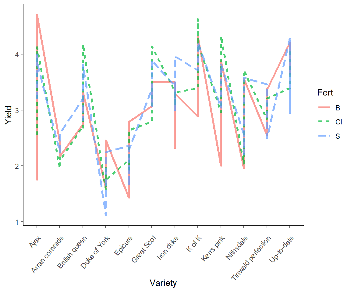
FIGURE 7.5: Line plot representation of the potato dataset.
7.3.6 Scatterplots
Here we summarize the asbio::world.emissions CO\(_2\) and gross domestic product data, using a tidyverse approach.
library(asbio)
data(world.emissions)
library(dplyr)
country.data <- world.emissions |>
  filter(continent != "Redundant") |>
  group_by(country) |>
  summarize(co2 = mean(co2, na.rm = TRUE),
            gdp = mean(gdp, na.rm = TRUE))
I don’t like the default ggplot2 margins. Specifically, I feel that the axis label font size is too small and placed too close to the axes. Thus, prior to making a scatterplot of these variables, I make my own margin theme, as a function, that calls theme().
margin_theme <- function(){
  theme(axis.title.x = element_text(vjust=-6, size = 12),
        axis.title.y = element_text(vjust=6, size = 12),
        axis.text = element_text(size = 10),
        plot.margin = margin(t = 7.5, r = 7.5, b = 22,
                             l = 22))
}
We can call this custom theme within ggplot code (Fig 7.6).
g <- ggplot(country.data, aes(x = gdp, y = co2)) +
  ylab(expression
       (paste(CO[2],
              " Emissions (metric tons x ", 10^6, ")"))) +
  xlab("GDP (international dollars)") +
  geom_point(size = 2) +
  scale_y_continuous(trans= "log10") +
  scale_x_continuous(trans= "log10") +
  theme_classic() +
  margin_theme()
g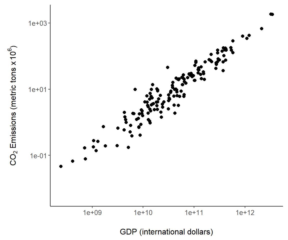
FIGURE 7.6: An example of a ggplot2 scatterplot using the world.emissions dataset.
I also called the built-in ggplot2 theme theme_classic() to generate an uncluttered graph with no grid lines.
Several other code steps are worth mentioning in Fig 7.6. First, note the use of plotmath code using calls to expression() in xlab() and ylab(). As an alternative, I could have used labs(x,y) where the arguments x and y would contain code for xlab() and ylab(). Second, \(\log_{10}\) transformations were applied to both axes using the ggplot2 functions scale_x_continuous() and scale_y_continuous(). As an alternative, I could have used the functions scale_x_log10() and scale_y_log10().
We can also require specific tick locations using scale_y_continuous (Fig 7.7).
g + scale_y_continuous(breaks = c(1, 50, 150, 500, 750, 1600),
                       trans= "log10")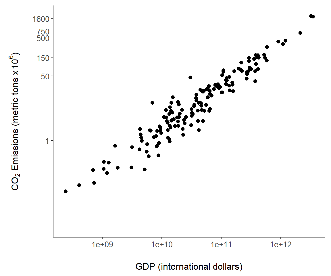
FIGURE 7.7: Custom tick mark locations overlaid on the \(y\)-axis of Fig 7.6.
7.3.7 Transformations
Other than \(\log_{10}\) transformations (Fig 7.6), several other graphical transformation can be readily applied in the transform function of scale_x_continuous() and scale_y_continuous(), including "asn" (arcsine), "atanh" (the inverse hyperbolic tangent), "boxcox" ( i.e., the optimal power transform for the response variable in a linear model (see Aho (2014))), "log" (\(\log_e\) transform), "log1p" (\(\log_e\) transform, following the addition of 1 to prevent undefined logarithms of zeroes), "log2" (\(\log_2\) transform), "logit" (i.e., the log odds for a probability), "pseudo_log" (\(\log_e\) transform, NAs resulting from undefined logarithms of zeroes, are given the value zero), "probit" (i.e. the inverse CDF for a standard normal distribution), "exp", "modulus", "reciprocal", "reverse", "sqrt", "date", "hms", and "time".
7.3.8 Adding Model Fits
It is straightforward to add fits from statistical models to a ggplot object, for instance the object g created in Fig 7.6. Easily accessed modeling approaches include conventional general linear models and locally fitted models, like Generalized Additive Models (GAMs) and locally weighted scatterplot smoothers (LOWESS), that allow the association between x and y to “speak for itself” without the assumption of underlying global linear association (Aho 2014). By default, geom_smooth() provides a LOWESS fit using the function loess() from the R distribution stats package. The code geom_smooth(method = "lm") fits a general linear model, in this case, a simple linear regression (Fig 7.8). By default, error polygons are included with fits that represent 95% confidence intervals for the true fitted value. These can be turned off by specifying geom_smooth(se = FALSE).
g + geom_smooth(method = "lm") # call to lm fit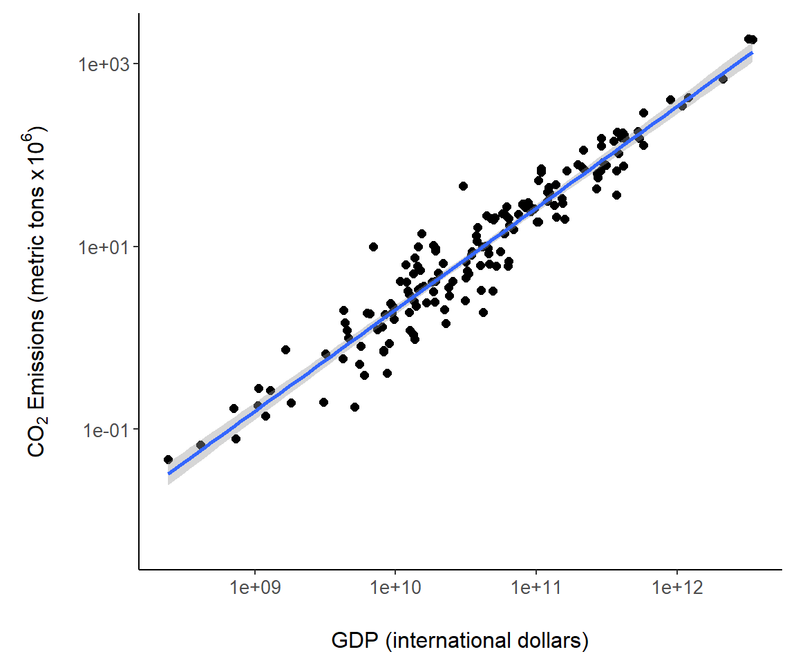
FIGURE 7.8: A regression model overlaid on Fig 7.6.
7.3.9 Annotations in Graphs
The ggplot2 package has nice functions for graph annotation. In Fig 7.9 we use the function geom_label() to label countries. The arguments nudge_y and nudge_x allow adjustments to label locations.
sub <- country.data |>
  filter(country %in% c("Canada", "Finland",
"Japan", "Kenya", "United States"))

g + geom_point(size = 3, shape = 1, data = sub,
               col = "orange") +
  geom_label(aes(label = country), data = sub, nudge_y = .25,
             nudge_x = -.25, alpha = .9, colour  = "orange")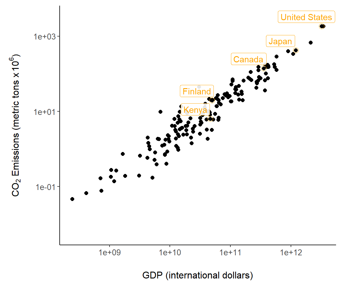
FIGURE 7.9: Country annotations added to Fig 7.6.
The ggpmisc package allows annotation of statistical models in a ggplot. This is accomplished using the function ggpmisc::stat_poly_eq() which fits a model usingstats::lm(), computes model quantities and prepares tidy text summaries of the model including the model equation, test statistic values and \(p\)-values. Computed terms are called using the ggplot2 function after_stat(), which delays aesthetic mapping in aes() until after statistic calculation.
In Fig 7.10, the equation for the world.emissions regression model is placed in the figure with after_stat(eq.label), and the adjusted \(R^2\) (Aho 2014) is placed using after_stat(adj.rr.label). A complete list of available computed terms, including eq.label and adj.rr.label, is given in the documentation for stat_poly_eq().
library(ggpmisc)

g + geom_smooth(method = "lm") +
stat_poly_eq(aes(label = paste(after_stat(eq.label),
                                  after_stat(adj.rr.label),
                                  sep = "*\", \"*")))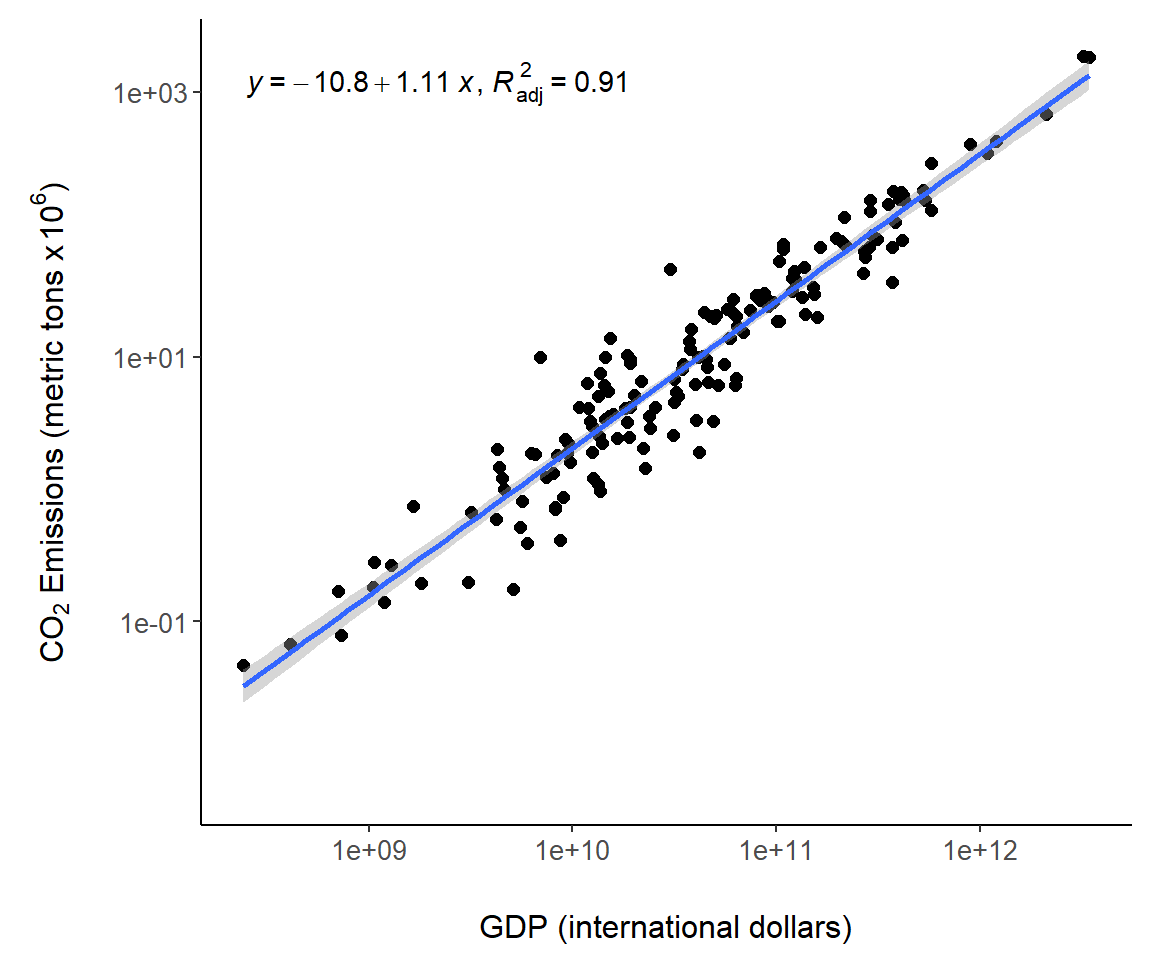
FIGURE 7.10: Regression model summaries overlaid on Fig 7.6.
A potential criticism of ggplot2 is that its graphical rendering approaches are not readily accessible (as code or output), and statistical summaries are often not adequately or clearly described (in documentation or output). For instance, when using geom_smooth() it is unclear which default smoothing parameters are actually being used, although these can be set within geom_smooth(). The function ggplot2::ggplot_build() provides underlying plotting details. For example
head(ggplot_build(g)$data[[1]]) x y PANEL group shape colour fill size alpha stroke
1 10.494 0.40732 1 -1 19 black NA 2 NA 0.5
2 10.085 0.51149 1 -1 19 black NA 2 NA 0.5
3 11.428 1.63089 1 -1 19 black NA 2 NA 0.5
4 NA -0.31447 1 -1 19 black NA 2 NA 0.5
5 10.642 1.00675 1 -1 19 black NA 2 NA 0.5
6 NA -0.95782 1 -1 19 black NA 2 NA 0.5The gginnards package can be used to generate accessible ggplot analytical information. This can be done by calling gginnards::geom_debug() within ggpmisc::stat_poly_eq().
Example 7.5 \(\text{}\)
As an example, recall that a \(\log_{10}-\log_{10}\) transformation was used to generate the scatterplot object, g, used to project Fig 7.6.
I can summarize the linear model, applied in Fig 7.8, with the code:
library(gginnards)
g + stat_poly_eq(formula = y ~ x, geom = "debug",
                 output.type = "numeric",
                 dbgfun.data = function(x)x[["coef.ls"]])
[1] "PANEL 1; group(s) -1; 'draw_function()' input 'data' (anonymous function):"
[[1]]
Estimate Std. Error t value Pr(>|t|)
(Intercept) -10.8005 0.284296 -37.990 1.3821e-82
x 1.1109 0.026794 41.462 3.6215e-88This is in accordance with the linear model \(\log_{10}(\text{CO}_2) = -10.800518+ 1.110939\log_{10}(\text{GDP})\) obtained using the base function lm().
        (Intercept) log(gdp, base = 10)
           -10.8005              1.1109
\(\blacksquare\)
7.3.10 Secondary Axes
Secondary axes can be difficult to implement in ggplot2 because they require user specification of a one-to-one transformation, and the correct back-transformation. A simple possibility is a linear transformation109. Let \(y\) represent raw, untransformed data to be plotted on a primary axis. A linear transform of \(y\), to be plotted on the corresponding secondary axis, will have the form:
\[\begin{equation} y' = a + b \cdot y \tag{7.1} \end{equation}\]
with back-transformation:
\[\begin{equation} \frac{y' - a}{b} = y. \tag{7.2} \end{equation}\]
where \(y'\) denotes the transformed data, and \(a\) and \(b\) are user-defined constants.
When choosing a linear transform, it is helpful to remember that including a multiplier (allowing \(b\) to equal a number other than \(1\)), will increase the data variance (spread) by a factor of \(b^2\), and that adding a constant (letting \(a\) be a number other than \(0\)), will cause the data mean to shift by \(a\) units, but will not affect the data variance (see Aho (2014)).
Example 7.6 \(\text{}\)
To demonstrate secondary axes, we will examine two datasets published by Rubino et al. (2013) concerning CO\(_2\) and \(\delta ^{13}\)C trapped in Antarctic ice layers. We wish to simultaneously plot CO\(_2\) and \(\delta^{13}\)C of as a function of the age of the depositional layer. We will use the primary (left-hand) vertical axis to plot CO\(_2\) and the use the right hand axis for \(\delta ^{13}\)C. We first create a composite dataset for years in which both CO\(_2\) and \(\delta ^{13}\)C were measured.
data(Rabino_CO2); data(Rabino_del13C)
# Match 1st dataset with 2nd
w <- which(Rabino_CO2$effective.age %in%
             Rabino_del13C$effective.age)
R.C <- Rabino_CO2[w,]
# match 2nd dataset with 1st
w <- which(Rabino_del13C$effective.age %in%
             R.C$effective.age)
R.d <- Rabino_del13C[w,]
data.C <- data.frame(
  CO2 = tapply(R.C$CO2, R.C$effective.age, mean),
  d13C = tapply(R.d$d13C.CO2, R.d$effective.age, mean),
  year = as.numeric(levels(factor(R.d$effective.age))))
For the years (ice depths) under consideration, CO\(_2\) levels vary between approximately 277 and 368 ppm. A range of around 100 ppm.
  range_ppm
1    277.16
2    368.02
Experimentation with linear transformations, Eq (7.1), reveals that a similar numeric range can be generated for \(\delta ^{13}\)C with the transformation: \(y' = 56 \cdot y + 729\).
  range_ppm
1    277.11
2    373.34
Thus, we create:
and use it in the ggplot code below. A scatterplot of the data is shown in Fig 7.11.
ggplot(data.C, aes(x = year, y = CO2)) +
  geom_point(colour = "blue", size = 2.7, alpha = 0.2) +
  theme_classic() +
  margin_theme() +
  ylab(expression(paste("C",O[2], " (ppm)"))) +
  geom_point(data = data.C, aes(x = year, y = td13C),
             colour = "red",
             size = 2.7, alpha = 0.2) +
  scale_y_continuous(
    sec.axis = sec_axis(~ (. - 730)/56,
                        name = expression(paste(delta^13,
                                                "C (\u2030)")))) +
theme(axis.text.y.right = element_text(colour = "red")) +
theme(axis.text.y.left = element_text(colour = "blue")) +
theme(axis.title.y.right = element_text(colour = "red")) +
theme(axis.title.y.left = element_text(colour = "blue")) +
theme(axis.line.y.right = element_line(colour = "red")) +
theme(axis.line.y.left = element_line(colour = "blue")) +
theme(axis.ticks.y.right = element_line(colour = "red")) +
xlab("Year")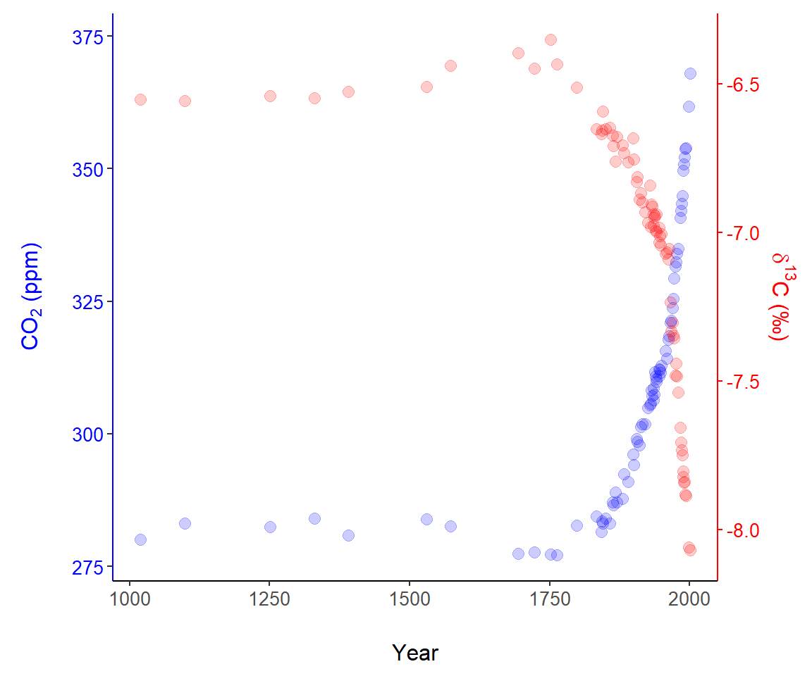
FIGURE 7.11: A graphical representation of data published by Rubino et al. (2013), using two vertical axes.
There were two vital steps for creating the secondary axis.
- First, as a preliminary step, we transformed the raw \(\delta^{13}\)C data to allow plotting \(\delta^{13}\)C points in the range of CO\(_2\) observations (Line 1). The result is the object
data.C$td13C. - Second, in Lines 8-11 we scale the secondary axis based on a back-transformation of the transformed data (Eq (7.2)). That is, we solve for \(y\) in \(y' = 56 \cdot y + 730\) and find \(y = (y' - 730)/56\). This is what underlies the code on Line 11:
sec.axis = sec_axis(~ (. - 730)/56,. Note that axis components were painstakingly colored usingggplot2::theme()(Lines 14-20).
\(\blacksquare\)
7.3.11 Defining Graphical Features using Vectors
As we have already seen, it is straightforward to define figure plotting characteristics (symbols, symbol sizes, colors, line types, etc.) using relevant data.
Example 7.7 \(\text{}\)
In Fig 7.12 we change symbols and colors for a representation of the asbio::fly.sex dataset based on experimental treatments:
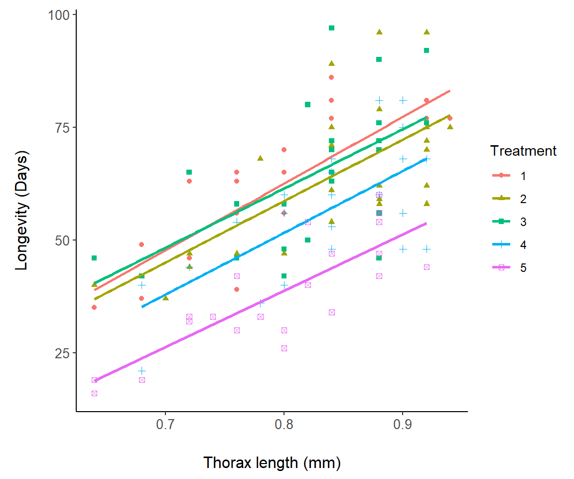
FIGURE 7.12: A representation of the fly.sex dataset.
Note that the linear fits in Fig 7.12 are actually for separate regression models, longevity ~ thorax, for each level in fly.sex$Treatment. They are not from the single ANCOVA model: lm(longevity ~ thorax * Treatment), although this is not clear at all from the ggplot graph. It is, however, revealed from:
g1 + stat_poly_eq(formula = y ~ x, geom = "debug",
                 output.type = "numeric",
                 dbgfun.data = function(x) x[["coef.ls"]])
`geom_smooth()` using formula = 'y ~ x'[1] "PANEL 1; group(s) 1, 2, 3, 4, 5; 'draw_function()' input 'data' (anonymous function):"
[[1]]
Estimate Std. Error t value Pr(>|t|)
(Intercept) -55.699 16.834 -3.3087 3.0654e-03
x 147.790 20.795 7.1071 3.0692e-07
[[2]]
Estimate Std. Error t value Pr(>|t|)
(Intercept) -50.242 24.519 -2.0491 0.05202337
x 136.127 29.186 4.6640 0.00010753
[[3]]
Estimate Std. Error t value Pr(>|t|)
(Intercept) -43.725 31.325 -1.3958 0.1760921
x 131.450 37.812 3.4764 0.0020423
[[4]]
Estimate Std. Error t value Pr(>|t|)
(Intercept) -57.992 28.260 -2.0521 0.05171441
x 137.001 33.625 4.0744 0.00046763
[[5]]
Estimate Std. Error t value Pr(>|t|)
(Intercept) -61.28 15.225 -4.0250 5.2871e-04
x 125.00 18.944 6.5983 9.8692e-07\(\blacksquare\)
7.3.12 Modifying Legends
Note that a legend was created for Fig 7.12 because of designation of groups in the initial aesthetics. Legend characteristics generally need to be modified using theme(). For instance, to change the legend location from the right-hand side of the plot to the the left-hand side, I could use:
g1 + theme(legend.position = "left")7.3.13 Multiple plots
We can place multiple ggplots into a single graphics device using several approaches. I consider two here: 1) facet functions from the ggplot2 package, and 2) ggplot extension functions from the package cowplot.
7.3.13.1 Faceting
The functions facet_wrap() and facet_grid() can be used to generate a sequence of plot panels.
Example 7.8 \(\text{}\)
I will modify Fig 7.12 to demonstrate the use of facet_wrap().
g1 <- ggplot(fly.sex, aes(y = longevity, x = thorax,
                         group = Treatment)) +
  geom_point(aes(colour = Treatment, shape = Treatment)) +
  facet_wrap(vars(Treatment)) +
  theme_classic() +
  margin_theme() +
  geom_smooth(method = "lm", se = F,
              aes(colour = Treatment)) +
  labs(x = "Thorax length (mm)", y = "Longevity (Days)")
g1
`geom_smooth()` using formula = 'y ~ x'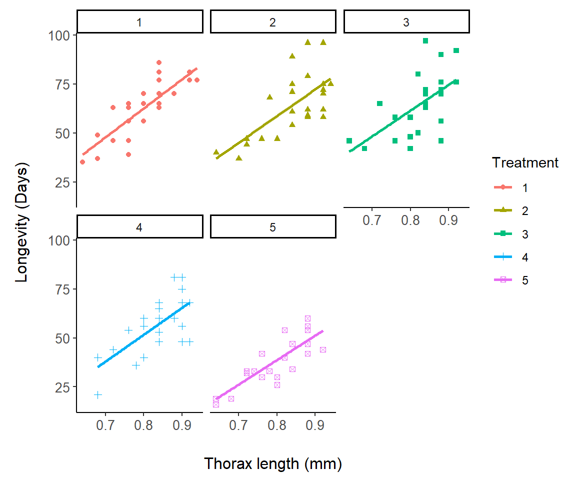
FIGURE 7.13: Demonstration of facet_wrap using the fly.sex dataset.
On Line 4 I specify that different panels should be created for each treatment level using: facet_wrap(vars(Treatment)). This could also be accomplished using: facet_wrap(~Treatment).
\(\blacksquare\)
7.3.13.2 cowplot functions
Multiple plots can also be assembled into a single graphical entity using functions from the cowplot package. This requires creating separate plot objects and concatenating them in cowplot::plot_grid().
Example 7.9 \(\text{}\)
Fig 7.14 shows summaries of US per capita CO\(_2\) emissions and GDP since the start of the industrial revolution with two plots.
library(cowplot)
US <- world.emissions |>
  filter(country == "United States")

g2 <- ggplot(US) +
  geom_line(aes(year, co2/population), col = "dark red") +
  theme_classic() + margin_theme() +
  theme(axis.text.x = element_text(angle = 50, hjust = 1,
                                   vjust = 0.9)) +
  labs(x = "Year",
       y = expression(paste("Per capita ", CO[2],
                            " emissions (tonnes x ",
                            10^6, ")")))

g3 <- ggplot(US) +
  geom_line(aes(year, gdp/population), col = "blue") +
  theme_classic() + margin_theme() +
  theme(axis.text.x = element_text(angle = 50, hjust = 1,
                                   vjust = 0.9)) +
  labs(x = "Year", y = expression(paste("Per capita GDP")))

plot_grid(g2, g3)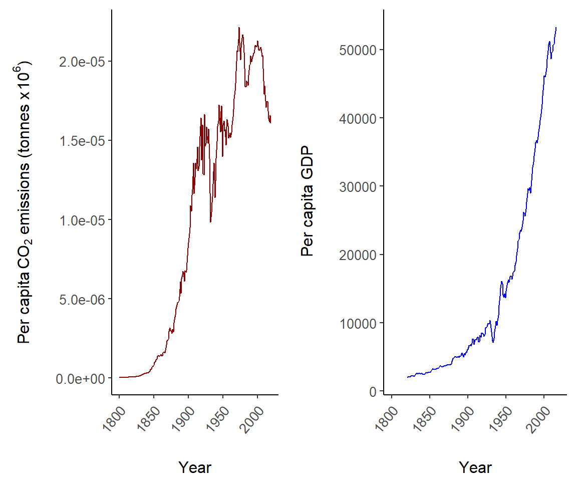
FIGURE 7.14: Two plots depicting US per capita trends in CO\(_2\) emissions and GDP.
The function plot_grid is used on Line 22 to conjoin the ggplot objects g2 and g3.
\(\blacksquare\)
7.3.14 Univariate Distributional Summaries
A number of ggplot2 functions can be used to graphically summarize distributions of variables. These include geom_hist() for histograms, geom_area() for area plots, geom_freq() for frequency plots, geom_dotplot() for dot plots, and geom_density() for density plots.
Example 7.10 \(\text{}\)
Fig 7.15 provides a multi-plot distributional summary of the US CO\(_2\) data using a histogram, an area plot, and a frequency plot. These are created as separate ggplot objects.
xlab <- expression(
  paste(CO[2], " Emissions (metric tons x ", 10^6, ")"))
Years <- factor(c(rep("1800-1854", 55), rep("1854-1908", 55),
           rep("1908-1962", 55), rep("1962-2019", 55)))

margin_theme2 <- function(){
  theme(axis.title.y = element_text(hjust=0.6, vjust = 2.8,
                                    size = 10),
  plot.margin = margin(t = 7.5, r = 7.5, b = 7.5, l = 15))
}

histogram <- ggplot(US, aes(co2, fill = Years)) +
  geom_histogram(binwidth = 500) +
  theme_classic() +
  scale_fill_brewer(palette = "Blues") +
  xlab(xlab) + ylab("Frequency") +
  margin_theme()

areaplot <- ggplot(US, aes(co2, fill = Years)) +
  geom_area(stat="bin") +
  theme_classic() +
  scale_fill_brewer(palette = "Spectral") +
  xlab("") + ylab("Frequency") +
  margin_theme2()

freqplot <- ggplot(US, aes(co2, colour = Years)) +
  geom_freqpoly() +
  theme_classic() +
  scale_fill_brewer(palette = "Spectral") +
  xlab("") + ylab("") +
  margin_theme2()
The histogram, area plot, and frequency plot are created on Lines 13-17, 19-24, and 26-31, respectively. Note the use of a second margin theme (Lines 5-8) and the use of ggplot2::scale_fill_brewer() to define specific RColorBrewer color palettes.
The plots are conjoined, with the area plot and frequency plot splitting the first row, and the histogram occupying the entire second row of the graphical device using cowplot::plot_grid().
title <- ggdraw() + draw_label(expression(
  paste(CO[2] , " in the US")),
  fontface='bold')
top_row <- plot_grid(areaplot, freqplot, ncol = 2,
                     labels = "AUTO")

plot_grid(title, top_row, histogram,
          rel_heights = c(0.2, 1, 1.2),
          hjust = c(0,0,-0.6), nrow = 3,
          labels = c("", "", "C"))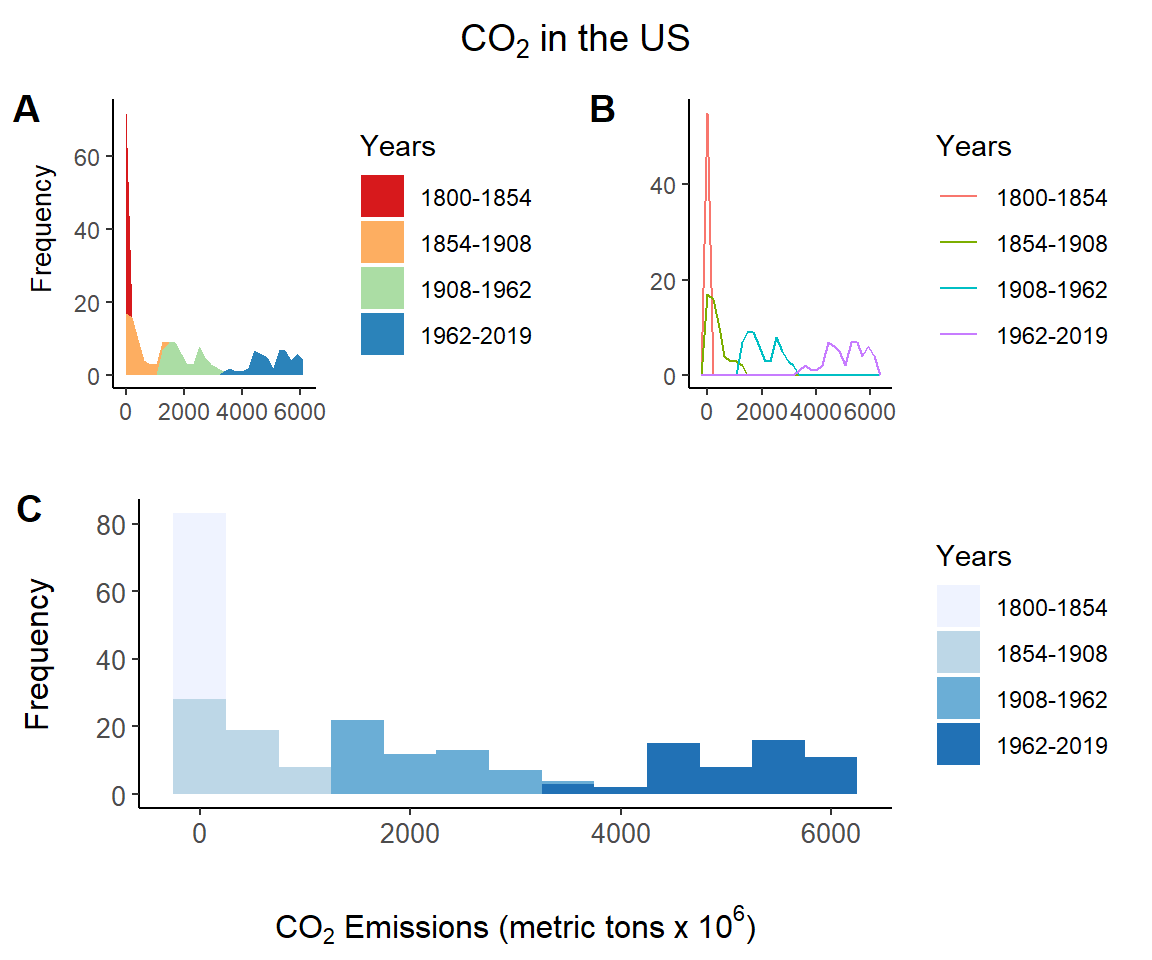
FIGURE 7.15: Distributional summaries of the US CO\(_2\) data from asbio::world.emissions.
\(\blacksquare\)
7.3.15 Barplots
Barplots are straightforward to create in ggplot2 using the function geom_bar().
Example 7.11 \(\text{}\)
Consider the asthma dataframe from asbio. We first convert the time series to a long table format using reshape2::melt(), and summarize it using dplyr::summarise().
library(reshape2); data(asthma)
asthma.long <- asthma |> melt(id = c("DRUG", "PATIENT"),
                               value.name = "FEV1",
                               variable.name = "TIME")

asthma.long$TIME <- factor(
  asthma.long$TIME, labels = c("BASE",
                               paste("H", 11:18, sep = "")))

summary.FEV <- asthma.long |>
  group_by(TIME, DRUG) |>
  summarise(mean = mean(FEV1),
            se = sd(FEV1)/sqrt(length(FEV1)),
            meanmse = mean - se,
            meanpse = mean + se)
In the code for Fig 7.16 below, I group by drug treatments group = DRUG (line one) and plot bars using the mean values from summary.FEV using (Line 7). The argument stat = "identity" allows bar heights to be represented by individual numbers, in this case arithmmetic means. Use of stat = "identity" is required here. The argument position = "dodge" creates side by side bar plots (Line 7).
g <- ggplot(summary.FEV, aes(x = TIME, y = mean,
                             group = DRUG)) +
  margin_theme() +
  labs(y = "Forced Expiratory Volume (1 min)",
       x = "Time Period")

g + geom_bar(stat = "identity", position = "dodge",
             aes(fill = DRUG))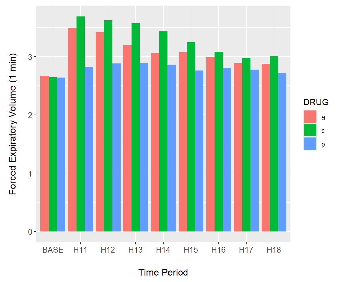
FIGURE 7.16: Barplot of the asthma data created using geom_bar().
\(\blacksquare\)
7.3.16 Interval Plots
The ggplot2 package allows implementation of interval plots.
Example 7.12 \(\text{}\)
As an initial demonstration of interval plots, we continue use of barplots from Example 7.11. Overlaying errors on barplots requires the use of stat_summary() (Line 1) in the code below. Outcomes from meanmse and meanpse in the summary.FEV dataset represent \(\bar{x}-SE\) and \(\bar{x}+SE\), respectively. These will define the lower and upper values of the error bars in interval plot. They are called in the arguments ymin and ymax in the aesthetics of geom_errorbar() (Line 5). The background color of the plot is changed on Line 4. The final result is shown in Fig 7.17.
g + stat_summary(fun = "identity", geom = "bar",
                 position = position_dodge(width = .9),
                 aes(colour = DRUG), fill = "white") +
  theme(panel.background = element_rect(fill = gray(0.8))) +
  geom_errorbar(aes(ymin = meanmse, ymax = meanpse,
                    colour = DRUG),
                width = 0.2, position = position_dodge(.9))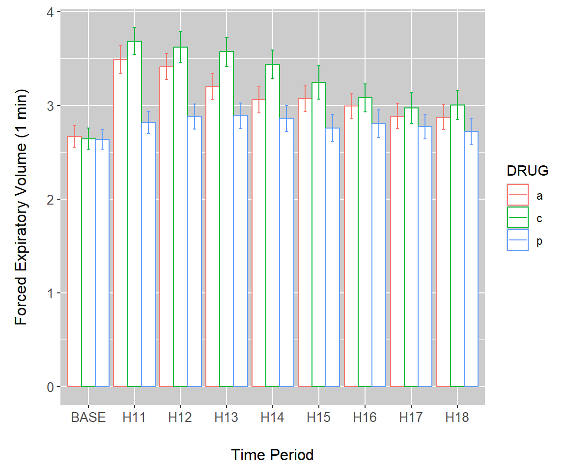
FIGURE 7.17: Error bars overlaid on a bar plot of the asthma data.
\(\blacksquare\)
Example 7.13 \(\text{}\)
Next we consider overlaying intervals on a line plot Fig (7.18). In the code below, lines connect points at treatment means (Lines 1-2).
g + geom_point(size = 2, aes(colour = DRUG)) +
  geom_line(aes(lty = DRUG, colour = DRUG)) +
  theme_classic() +
  margin_theme() +
  geom_errorbar(aes(ymin = meanmse, ymax = meanpse,
                    colour = DRUG), width = 0.2)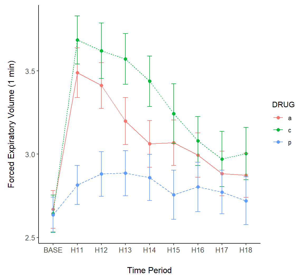
FIGURE 7.18: Error bars overlaid on a line plot of the asthma data.
\(\blacksquare\)
Example 7.14 \(\text{}\)
Other geoms can be used to create interval plots, including the ggplot2 function geom_crossbar(). In Fig 7.19 we show both raw data and summary standard error crossbars.
g + geom_crossbar(aes(ymin = meanmse, ymax = meanpse,
                      colour = DRUG, fill = DRUG),
                  alpha = .2) +
  geom_point(data = asthma.long, aes(y = FEV1, x = TIME,
                                     colour = DRUG))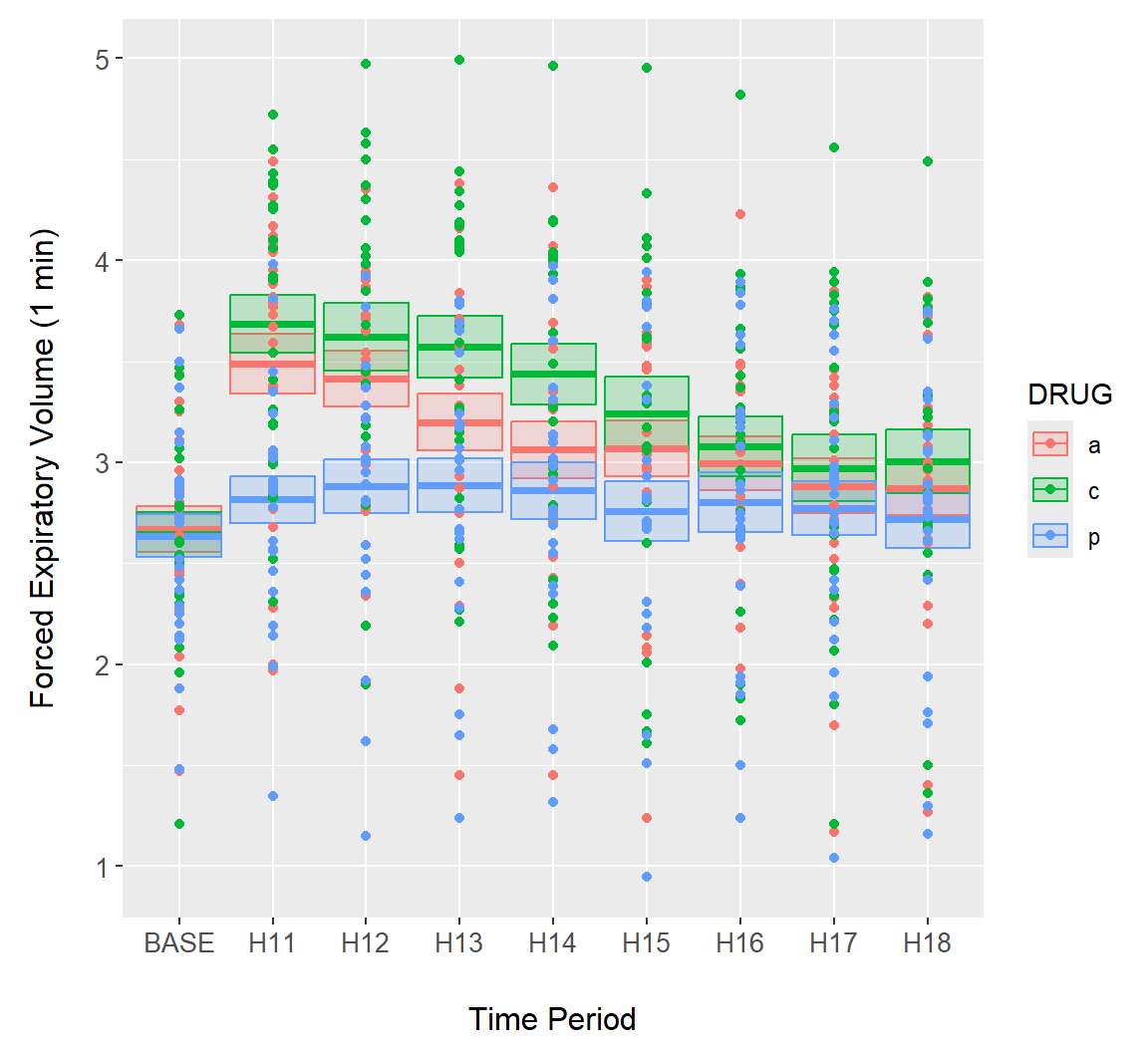
FIGURE 7.19: Error bars overlaid on the asthma data using geom_crossbar().
Note that individual data points are rather difficult to distinguish in Fig 7.19. As a solution we could plot points using using transparent colors, or jitter points with respect to the \(x\)-axis (Fig 7.20).
g + geom_crossbar(aes(ymin = meanmse, ymax = meanpse,
                      colour = DRUG, fill = DRUG),
                  alpha = .2) +
  geom_jitter(data = asthma.long, aes(y = FEV1, x = TIME,
                                      colour = DRUG),
              alpha = .4, width = 0.15) +
  theme_classic()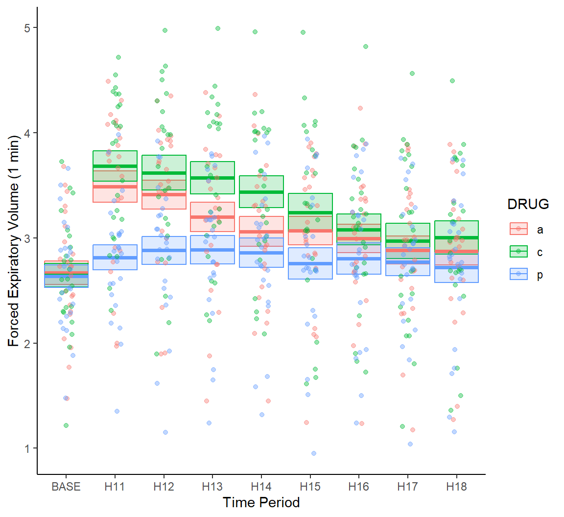
FIGURE 7.20: Jitter and transparency added to points in Fig 7.19.
\(\blacksquare\)
7.3.16.1 Pairwise Comparisons
Results of statistical pairwise comparisons can be overlain on ggplot2 rendered boxplots and interval plots using a number of approaches. The package ggpubr (Kassambara 2023) generates ggplot2-based ``publication ready plots’’, including interval plots showing pairwise comparisons. Examples given here largely follow those in the documentation for ggpubr.
Example 7.15 \(\text{}\)
Crampton et al. (1947) measured the lengths of odontoblasts (cells responsible for tooth growth) in 60 guinea pigs with respect to three dosage levels of vitamin C (0.5, 1, and 2 mg/day), and two delivery methods, orange juice (OJ) or ascorbic acid (VC). The data are in the dataframe ToothGrowth from the package datasets. In ToothGrowth dose contains dosages and supp contains delivery levels.
library(ggpubr)
df <- ToothGrowth
df$dose <- as.factor(df$dose)

bxp <- ggboxplot(
  df, x = "dose", y = "len",
  color = "supp", palette = c("#00AFBB", "#E7B800")) +
  ylab(expression(paste("Odontoblast length (", mu,"g)"),
                  sep = "")) +
  xlab("Dosage (mg/day)") +
  guides(color=guide_legend("Delivery:"))  +
  scale_y_continuous(
    expand = expansion(mult = c(0.05, 0.10)))

bxp + geom_pwc(
  aes(group = supp), tip.length = 0,
  method = "t_test", label = "{p.adj.format}{p.adj.signif}",
  p.adjust.method = "bonferroni", p.adjust.by = "panel",
  hide.ns = TRUE
)
In the code above, we have the following important steps:
- On Lines 1-3, I bring in the ggpubr package (Line 1), rename the dataframe
ToothGrowthto bedfand coerce thedosecolumn to be a factor. - On Lines 5-7, I use the function
ggpubr::ggboxplot()to define basic plot characteristics. - On Lines 8-11, nuances are added to the plot including customized axis labels (Lines 8-9), a customized legend title (Line 11), and an alteration to the axis scale (Lines 12-13).
- On Lines 15-20, annotations for pairwise comparisons of delivery methods (
OJandVC) within dosages are added to the graph using the functionggpubr::geom_pwc(). - On Line 16, I specify that I want delivery methods (in
supp) compared, and indicate that I don’t want lines extending to the compared levels from the label lines (for comparison, see Fig 7.23). - On Line 17, I indicate the type of test to be used in delivery method comparisons, and the labeling format.
"{p.adj.format}{p.adj.signif}"indicates that both the adjusted p-value and the significance level for the adjusted p-value should be printed. - On Lines 18-19, I specify use of the Bonferroni correction for simultaneous inference for three tests, and to not print results that are non-significant.
The result is shown in Fig 7.21.
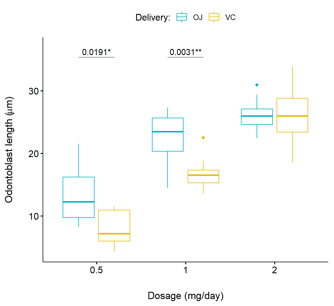
FIGURE 7.21: Boxplot showing pairwise comparison of delivery levels in dosage for the Toothgrowth dataframe.
Below we consider a more complex example that compares both delivery methods (supp) and dosage levels (dose). This is accomplished by applying ggpubr::geom_pwc() twice (Lines 3-7 and Lines 11-15) and printing both results (Fig 7.22).
# 1. Add p-values of OJ vs VC in each dose group
bxp.complex <- bxp +
  geom_pwc(
    aes(group = supp), tip.length = 0,
    method = "t_test", label = "p.adj.format",
    p.adjust.method = "bonferroni", p.adjust.by = "panel"
  )
# 2. Add pairwise comparisons between dose levels
# Nudge up the brackets by 20% of the total height
bxp.complex <- bxp.complex +
  geom_pwc(
    method = "t_test", label = "p.adj.format",
    p.adjust.method = "bonferroni",
    bracket.nudge.y = 0.2
  )
# 3. Display the plot
bxp.complex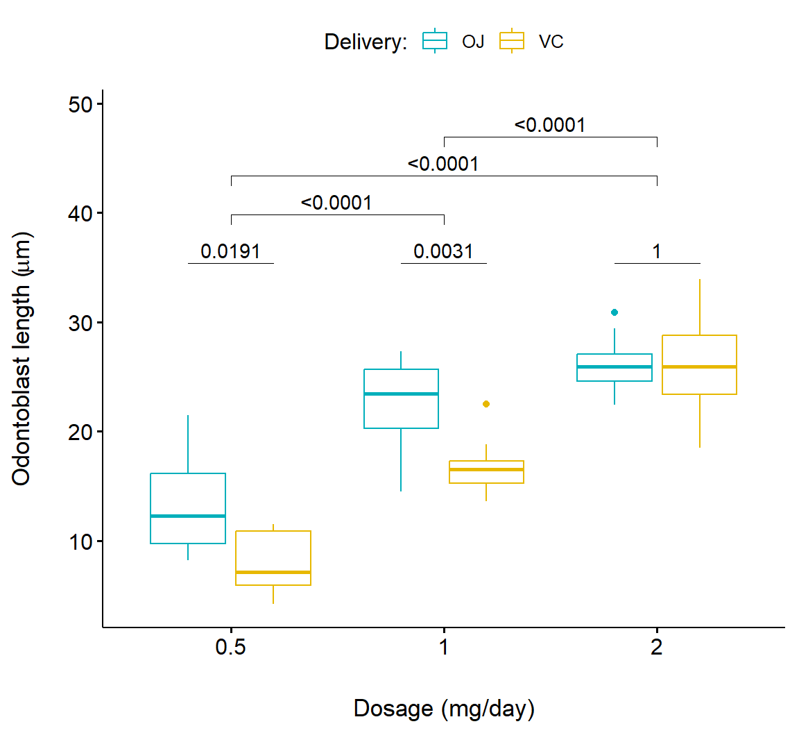
FIGURE 7.22: Boxplot showing pairwise comparison of delivery levels and delivery levels in dosage for the Toothgrowth dataframe.
In the code below, we create an interval plot with a barplot appearance using ggpubr::ggbarplot() (Fig 7.23). Note that this requires a different approach for customizing the title of the legend, using scale_fill_discrete(name = "Dosage:") (Line 8).
bp <- ggbarplot(
  df, x = "supp", y = "len", fill = "dose",
  palette = "npg", add = "mean_sd",
  position = position_dodge(0.8)) +
  ylab(expression(paste("Odontoblast length (", mu,"m)"),
                  sep = "")) +
  xlab("Delivery method") +
  scale_fill_discrete(name = "Dosage:")

bp +
  geom_pwc(
    aes(group = dose), tip.length = 0.05,
    method = "t_test", label = "p.signif",
    bracket.nudge.y = -0.08
  ) +
  scale_y_continuous(expand = expansion(mult = c(0, 0.1)))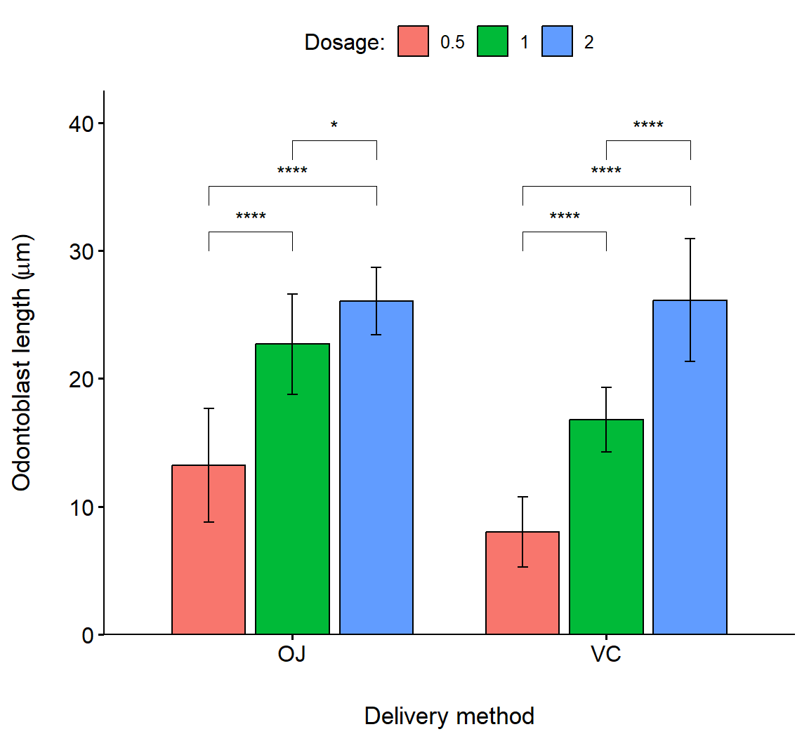
FIGURE 7.23: Barplot showing pairwise comparison of dosage levels in delivery methods for the Toothgrowth dataframe. Bar heights are means, errors are standard deviations.
\(\blacksquare\)
CAUTION!
The function ggpubr::geom_pwc() can be potentially misused, illustrating the need for clear explanations (or understanding) when applying statistical algorithms. The default test specification in geom_pwc() is the Wilcox test, which will seldom be the most powerful method for comparing shifts in location for treatments (although it is strongly resistant to violations of normality). The argument test = t_test (specified in Figs 7.21-7.23) runs \(t\)-tests in isolation for each pairwise comparison, and thus will not utilize an omnibus ANOVA mean squared error, reducing power. The Bonferroni \(p\)-value adjustment method used in Figs 7.21-7.23 is also famous for its low power. Given this situation, it may be most prudent to use ggpubr::geom_pwc() as a graphical framework into which summaries, including \(p\)-values can be inserted manually. This can be done with the function ggpubr::stat_pvalue_manual() whose usage is demonstrated here.
7.3.17 Trellis Plots with Faceting
Like the package lattice, ggplot2 contains functions for making trellis plots. We will use this approach to examine individual patient responses over time in the asthma dataset.
Trellising can be enabled by using the ggplot2 functions facet_wrap() and facet_grid(). In Fig 7.24 we define faceting within facet_grid() using the PATIENT column in the data subset asthma.long.a. The function ggplot2::vars() in facet_grid() is analogous to the use of aes() in geoms.
g <- ggplot(asthma.long.a, aes(y = FEV1, x = TIME,
                               colour = DRUG,
                                group = DRUG)) +
  geom_point() +
  geom_line() +
  theme_light() + margin_theme() +
  theme(axis.text.y = element_text(size=rel(0.7))) +
  facet_grid(rows = vars(PATIENT)) +
  scale_colour_brewer(palette = "Dark2") +
  ylab("Forced Expiratory Volume (1 min)") +
  xlab("Time period")
g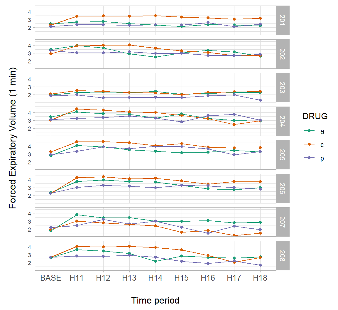
FIGURE 7.24: A trellis plot showing individual patient responses over time from the asthma dataset.
7.3.18 Multivariate Distributional Summaries
Bivariate summaries can be shown in many ways using a ggplot2 approach.
Example 7.16 \(\text{}\)
In Fig 7.25, I insert density grobs (graphical objects) on the margins of a scatterplot for five European countries using the cowplot functions axis_canvas(), insert_xaxis_grob(), insert_xaxis_grob(), and gg_draw(). The right margin shows GDP distributions for each country, whereas the top margin shows CO\(_2\) emission distributions for each country. I also change symbol sizes with year in the main graph. Larger symbols indicate more recent years.
europe <- world.emissions |>
  filter(country == c("France", "Italy",
                      "Germany", "United Kingdom")) |>
  filter(year <= 2019 & year > 1950) # comparable data

pmain <- ggplot(europe, aes(x=co2, y=gdp, color= country)) +
  geom_point(aes(size = year), alpha = .6) +
  xlab(xlab) + ylab("GDP (International dollars)") +
  margin_theme() +
  theme_classic()

xdens <- axis_canvas(pmain, axis = "x") +
  geom_density(data = europe, aes(x = co2, fill = country),
               alpha = 0.6, size = .2)

ydens <- axis_canvas(pmain, axis = "y") +
  geom_density(data = europe, aes(y = gdp, fill = country),
               alpha = 0.6, size = .2)

p1 <- insert_xaxis_grob(pmain, xdens, grid::unit(.2, "null"),
                        position = "top")
p2 <- insert_yaxis_grob(p1, ydens, grid::unit(.2, "null"),
                        position = "right")
ggdraw(p2)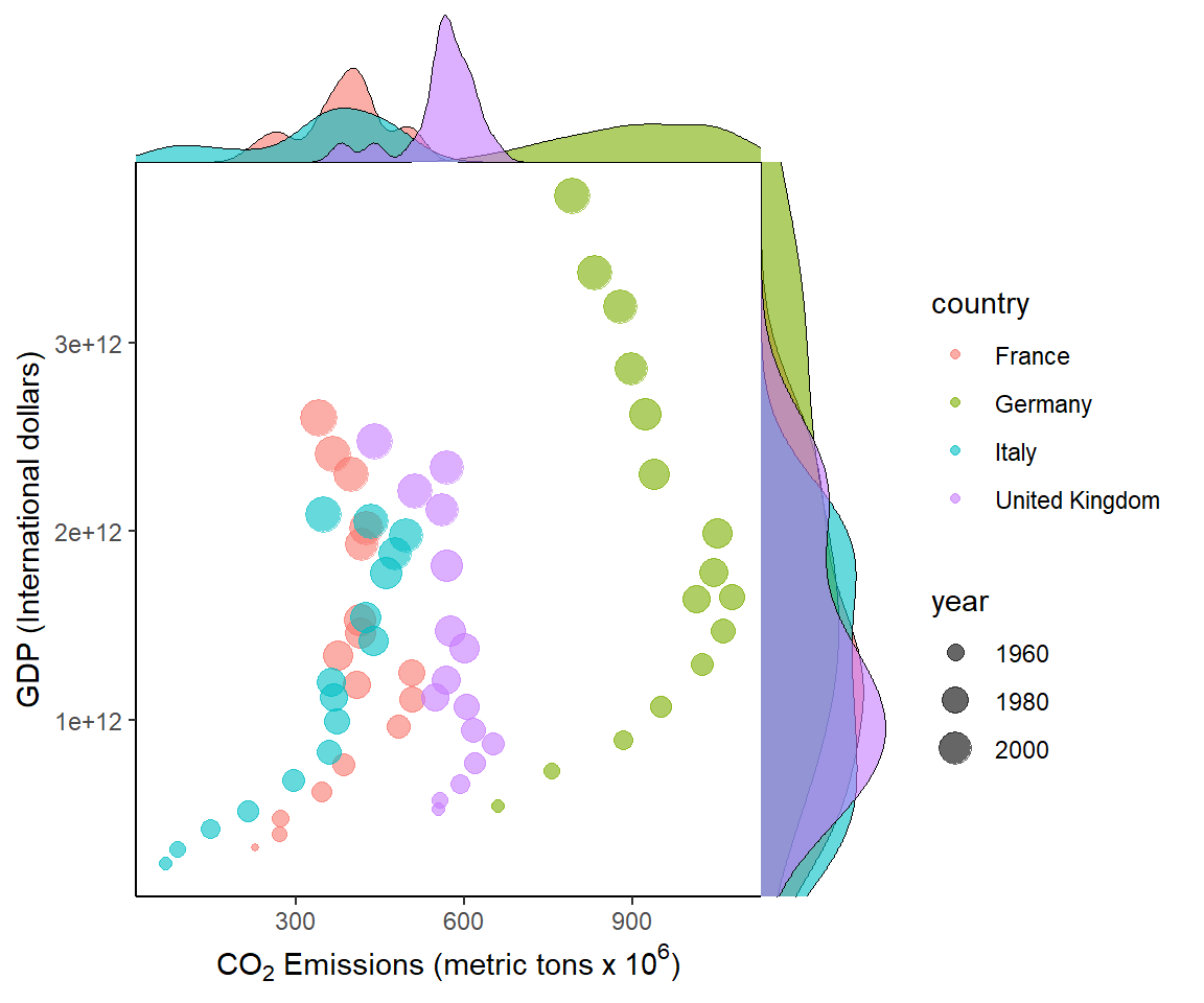
FIGURE 7.25: Bivariate summaries for European countries from the asbio::world.emissions dataset.
\(\blacksquare\)
7.3.19 Maps
The ggplot2 ecosystem has some support for mapping, including import of ARC-GIS shape files, and creation of map polygons. The function sf::st_read() allows loading of simple spatial features, including shapefiles, and the package ggspatial provides a number for creating useful maps under a ggplot2 framework.
Example 7.17 \(\text{}\)
As an example we will create a map of a small stream network in southwest Idaho named Murphy Creek. Data concerning the creek, including shapefiles, is contained in the package streamDAG (K. Aho, Kriloff, et al. 2023).
library(sf); library(ggspatial); library(streamDAG)
mur_sf <- st_read(system.file("shape/Murphy_Creek.shp",
                              package="streamDAG"))
data(mur_coords)
coords <- mur_coords[,c(2,3)]
Reading layer `Murphy_Creek' from data source
`C:\Users\ahoken\AppData\Local\R\win-library\4.5\streamDAG\shape\Murphy_Creek.shp'
using driver `ESRI Shapefile'
Simple feature collection with 2 features and 2 fields
Geometry type: LINESTRING
Dimension: XY
Bounding box: xmin: 512860 ymin: 4789000 xmax: 514720 ymax: 4789300
Projected CRS: NAD83 / UTM zone 11NThe function ggplot2::geom_sf() (Line 2 below) can be used to draw different geometric objects depending on features present in the data, e.g., points, lines, or polygons. For the current case a line is generated. The function ggplot2::expand_limits() (Line 6) is used to increase the spatial range of the \(y\)-axis which otherwise would be extremely narrow (since a single W to E trending line, representing the watershed, is being generated by geom_sf()). The ggspatial functions annotation_scale() and annotation_north_arrow() provide spatially explicit scalebars and north-indicating arrows, respectively (Lines 8-9). The final product is shown in Fig 7.26.
g <- ggplot(mur_sf) +
  geom_sf(colour = "lightblue", lwd = 2) +
  theme_classic() +
  geom_point(data = coords, aes(x = E, y = N), shape = 21,
             fill = "orange", size = 2.5) +
  expand_limits(y = c(4788562,4789700)) +
  ylab("") + xlab("") +
  annotation_scale() +
  annotation_north_arrow(pad_x = unit(10.5, "cm"),
                         pad_y = unit(6.6, "cm"))
g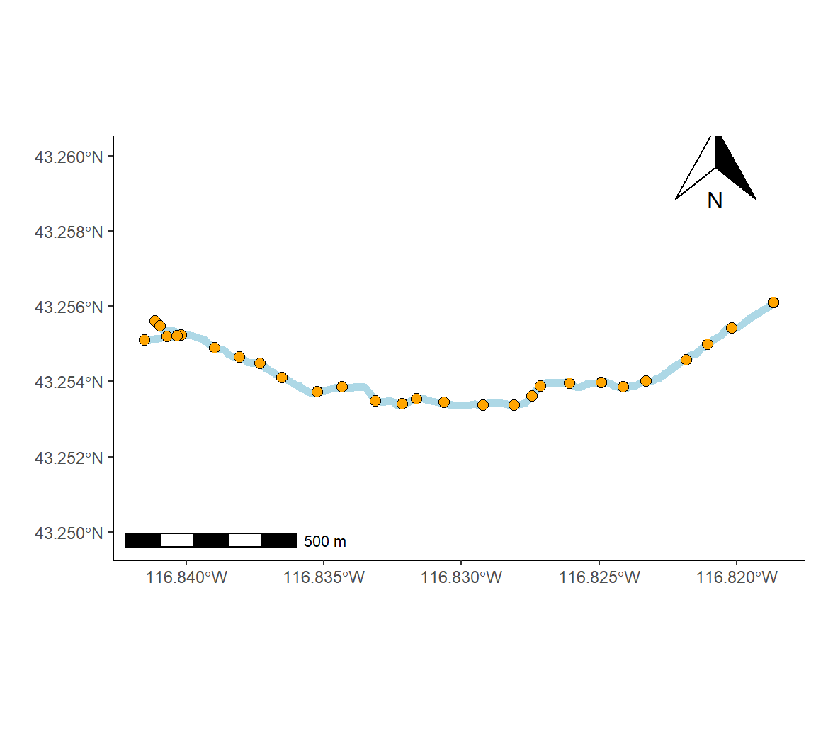
FIGURE 7.26: Map of the Murphy Creek drainage system in southwest Idaho (outlet coordinates: 43.71839 \(^\text{o}\)N, 116.13747 \(^\text{o}\)W).
\(\blacksquare\)
7.3.20 \(\bigstar\) Animation
Animations in ggplot2 can be created using looping strategies applied in Ch 6. Looping will be explicitly considered in the context of functions in Chapter 8.
Example 7.18 \(\text{}\)
As an initial demonstration, we reconsider the asthma data (Fig 7.16). We first construct a function, asthma.plot() which will render a ggplot. The lone argument of asthma.plot(), upper, defines the upper time limit of under consideration in the longitudinal asthma drug study (Line 3). The upper argument is called in geom_line() (Lines 5-6) to subset, if necessary, the underlying data. Vital to the animation is the print.ggplot() function (Line 13). Failure to include this code will create an empty animation.
summary.FEV$time <- rep(c(0,11:18), each = 3)

asthma.plot <- function(upper){
  a <- ggplot() +
    geom_line(data = summary.FEV[summary.FEV$time > 10 &
                                   summary.FEV$time <= upper,],
              aes(x = time, y = mean, colour = DRUG)) +
    ylim(2.6, 4) +
    xlim(11, 18) +
    margin_theme() +
    labs(y = "Forced Expiratory Volume (1 min)",
         x = "Time (Hrs)")
  print(a)
}
Next, we create a function that runs asthma.plot() for a range of values for upper. The function consists of a loop run by lapply() (Lines 2-4). The final lines of code (Lines 11-13) allow the animation to be saved using the function saveGIF() from the package animation110.
asthma.animate <- function() {
  lapply(12:18, function(i){
    asthma.plot(i)
  })
}

# run animation
asthma.animate()

# save frames into one GIF:
library(animation)
saveGIF(asthma.animate(), interval = 1,
        movie.name="asthma.gif")
The animation result is shown in Fig 7.27.
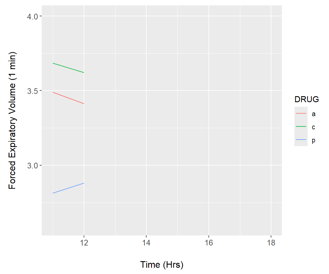
FIGURE 7.27: Animation demonstration using the asthma dataset.
\(\blacksquare\)
Amazing animations can be created with the package gganimate. These are demonstrated using several examples.
Example 7.19 \(\text{}\)
In this example we create a scatterplot animation for the world emissions dataset. In the code below, steps particularly important to the animation occur on Lines 15-18.
- On Line 15 the plot title is modified as the animation progresses, allowing tracking of years. The code
title = 'Year: {frame_time}'is a gganimate convention for extracting corresponding time sequence values (in this case the columnworld.emission$year) for a projection. - On line 17 The function
gganimate::transition_time()calls frame transitions between specific point in time in the columnyear. Usefully, the gganimate sets the transition time between the states intransition_time()to correspond to the actual time difference between them. - On line 18
ease_aes()is used to linearly smooth the animation (in terms of coloration and the geometric positioning of features) between animation frames. The function is based on analogous functions from the package tweener.
The package gapminder contains rational color designations (i.e., variations on prime colors within continents) for 142 countries. Countries without a color designation are colored gray by scale_colour_manual().
library(gganimate)
library(gapminder)
world.data.sub <- world.emissions |>
  filter(continent != "Redundant") |>
  filter(year > 1950)

g <- ggplot(world.data.sub, aes(x = gdp, y = co2,
                                size = population,
                                colour = country)) +
  geom_point(alpha = 0.7, show.legend = FALSE) +
  scale_colour_manual(values = country_colors) +
  scale_size(range = c(2, 12)) +
  scale_x_log10() + scale_y_log10() +
  facet_wrap(~continent) +
  labs(title = 'Year: {frame_time}', x = 'GDP') +
  ylab(bquote(CO[2])) +
  transition_time(as.integer(year)) +
  ease_aes('linear')
  margin_theme()
g
The final result is shown in Fig 7.28.
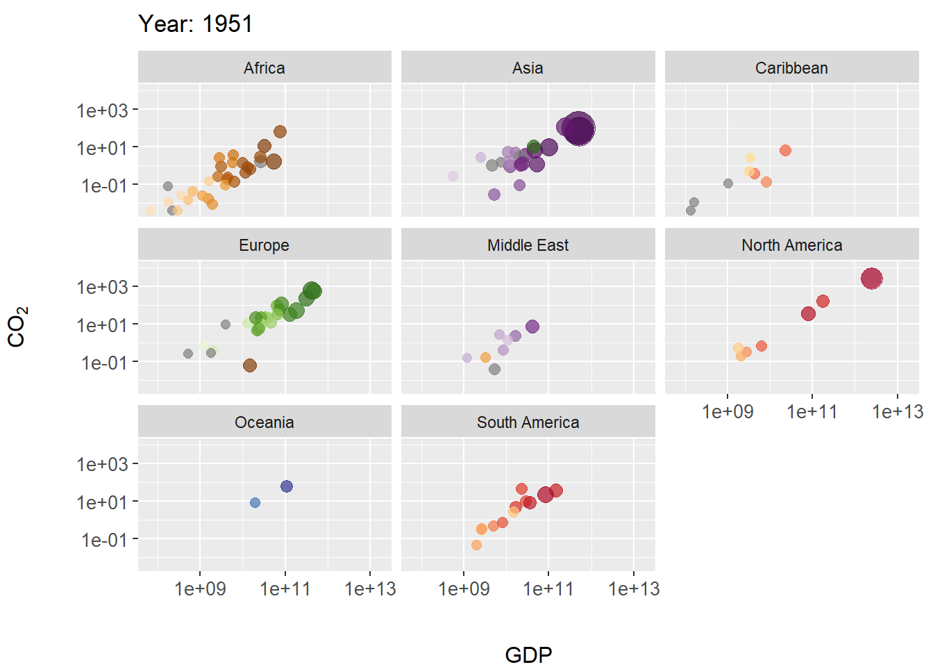
FIGURE 7.28: Animated scatterplot of CO\(_2\) levels over time for countries within continents. Symbol size scaled by population size.
\(\blacksquare\)
Example 7.20 \(\text{}\)
The next example uses gganimate to animate variation in CO\(_2\) levels over time within continents, using boxplots.
g <- ggplot(world.data.sub, aes(x = continent, y = co2,
                           group = continent)) +
  geom_boxplot(aes(fill = continent), show.legend = FALSE) +
  scale_y_log10() +
  labs(title = 'Year: {frame_time}', x = '',
       y = "CO\U2082") +
  theme(axis.text.x = element_text(angle = 50, hjust = 1,
                                   vjust = 0.9, size = 12)) +
  transition_time(as.integer(year))
g
The final result is shown in Fig 7.29.
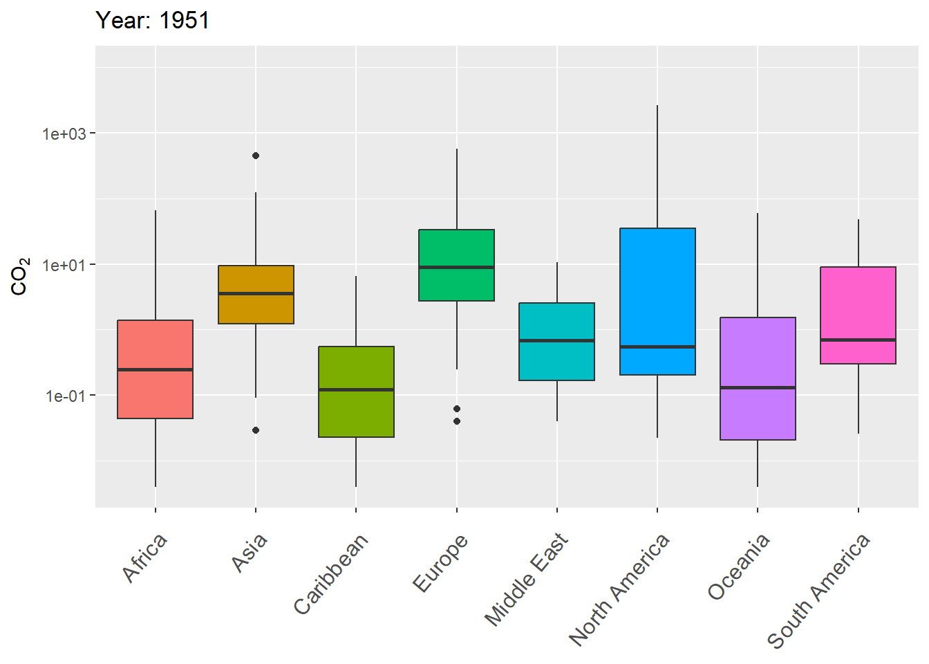
FIGURE 7.29: Animated boxplot of CO\(_2\) levels over time for countries within continents.
\(\blacksquare\)
Example 7.21 \(\text{}\)
As a final (rather complex) example, I animate the non-perennial character of Murphy Creek (Fig 7.26) over time.
To prepare for making the map animation, I first bring in a dataset that documents the presence/absence of surface water \(=\{0,1\}\) at 28 locations (i.e., nodes) over 1163 time steps, mur_node_pres_abs (Line 1). The 27 stream sections bounded by the the 28 nodes are defined as stream segments. I select from these time designations, at even intervals, to create a data subset of 250 time steps (Lines 2-8).
data(mur_node_pres_abs)
u <- unique(mur_node_pres_abs$Datetime)
n <- length(u)
frames <- 250
times.sub <- u[round(seq(1, n, length = frames),0)]

w <- which(mur_node_pres_abs$Datetime %in% times.sub)
mnpa.sub <- mur_node_pres_abs[w,]
In the code below, the function sf::st_coordinates() is used to pull spatial coordinates from the Murphy Creek shapefile underlying the map in Fig 7.26.
I also use several functions from the streamDAG package, including streamDAGs(), which creates a graph-theoretic representation of Murphy Creek (see K. Aho, Kriloff, et al. (2023)), and thus defines how the stream flows from location to location. The function streamDAG::STIC.RFimpute() is a wrapper for the random forest algorithm missForest::missForest(), and allows imputation of missing stream presence/absence data from the dataset mur_node_pres_abs. The function arc.pa.from.nodes() from streamDAG creates stream segment surface water presence/absence outcomes based on data from the downstream bounding node of each segment (approach = "dstream"). The function vector_segments() from streamDAG is used to create the dataframe vs that contains arcs designations for shapefile coordinates in sf.coords, based on coordinates in the object node.coords, and the function assign_pa_to_segments() adds surface water presence/absence designations to vs based on outcomes from the object arc.pa, whew.
mur_graph <- streamDAGs("mur_full")
# impute missing presence/absence data
out <- STIC.RFimpute(mnpa.sub[,-1])
mur.pa.sub <- out$ximp
# arcs from nodes
arc.pa <- arc.pa.from.nodes(mur_graph, mur.pa.sub,
                            approach = "dstream")

node.coords <- data.frame(mur_coords[,(2:3)])
row.names(node.coords) <- mur_coords[,1]
sf.coords <- st_coordinates(mur_sf)[,-3]

vs <- vector_segments(sf.coords, node.coords, realign = TRUE,
                      colnames(arc.pa), arc.symbol = " -> ")
datetime <- mnpa.sub$Datetime
vsn <- assign_pa_to_segments(vs, frames, arc.pa,
                             datetime = datetime)
Using the data summaries created from the steps above, I can finally create an animated ggplot map.
g <- ggplot(mur_sf) +
  geom_sf(colour = "gray", lwd = 1.8) +
  theme_classic() +
  geom_line(data = vsn, aes(x = x, y = y, group = arc.label,
                            colour = as.factor(Presence)),
              show.legend = FALSE, lwd = 1.5) +
  scale_colour_manual(values = c("orange","lightblue")) +
  geom_point(data = node.coords, aes(x = E, y = N),
             shape = 21, fill = "white", size = 1.4) +
  expand_limits(y = c(4788562,4789700)) +
  annotation_scale() +
  labs(title = "Date: {frame_time}", x = "", y = "") +
  annotation_north_arrow(pad_x = unit(10.5, "cm"),
                         pad_y = unit(6.6, "cm")) +
  transition_time(as.Date(vsn$Time))
The final result, Fig 7.30, shows changing patterns of surface water presence at the Murphy Creek network during the summer of 2019.
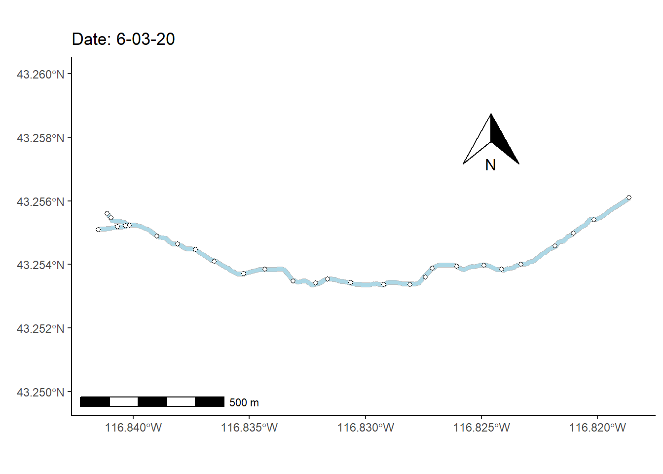
FIGURE 7.30: Paterns of drying at Murphy Creek, Idaho shown with an animated map. Blue segments indicate the presence of surface water.
\(\blacksquare\)
Exercises
-
Complete the following data management steps on the
asbio::world.emissionsdata.- Eliminate redundant rows using
continent != 'Redundant'anddplyr::filter. - Filter further to subset the data to the years 1955-2019.
- Filter further to subset the data to 8 countries of interest (your choice).
- Name the dataset
emissions.sub. - For the
emissions.subdataset, plot CO\(_2\) emissions as a function of year in a scatterplot. Save the ggplot as an object (e.g.,g).
- Eliminate redundant rows using
-
Continuing Question 1, overlay a linear regression model on
gusinggeom_smooth(method = "lm").- Extract fitted model components using
g + stat_poly_eq(formula = y ~ x, geom = "debug", )from libraries gginnards and ggmisc (see Example 7.5). What is the model slope? - Interpret the meaning of the shaded envelope around the line.
- Annotate the model onto the graph using:
g + stat_poly_eq()from library ggpmisc.
- Extract fitted model components using
Continuing Question 1, (1) color points in
gby country (use transparency to allow viewing of points laying atop each other), and (2) vary point size by population size.Continuing Question 1, add a label in
gidentifying US emissions in 2005.Continuing Question 1, use and/or to add reference lines to
g(your choice as to relevant \(x\) or \(y\)-axis location).Continuing Question 1, alter the the \(y\)-axis limits in
g(your choice of limits).Continuing Question 1, create (1) a boxplot, and (2) an interval plot showing CO\(_2\) emissions as a function of country. Interpret the meaning of the hinges, centers, and whiskers of the boxplot and interpret the “errors” in the interval plot.
-
(Advanced) For the dataframe
npkin the package datasets, use functions in the the package ggpubr to overlay results of pairwise comparisons of population means on interval plots. Specifically:- Use
ggbarplot()to make a barplot showing mean Yields and standard errors as a function of nitrogenNand phosphateP. Vary bar colors usingP. Create appropriate axis and legend labels. - Overlay pairwise comparisons for both
NandPlevels on the barplot using the functiongeom_pwc(). Specifymethod = t_testsince multiple tests for N will not occur within levels of P.
- Use
-
For the
asbio::goatsdataframe, use ggplot approaches to \(\dots\)- Make plots of the distribution of
NO3using two of the following functions:geom_area(),geom_freq(),geom_dotplot(), orgeom_density(). - Create a scatterplot of
NO3as a function of feces, Change symbol sizes to reflect the values inorganic.matter. - Plot
NO3andorganic.matteras simultaneous functions offecesby adding a second y-axis.
- Make plots of the distribution of
\(\bigstar\) Using gganimate, and the
asbio::asthmadataframe, track subject FEV1 levels over time withgeom_point(). Use faceting to distinguish drug levels.